Clean up the UI from unnecessary labels
As more features are added, I expect the UI to become more cluttered with graphical elements.
I think some of them are unnecessary because they don't provide any additional information but take up screen space.
In particular, the "description" labels could be removed altogether, as they're just annoying (see attached screenshots).
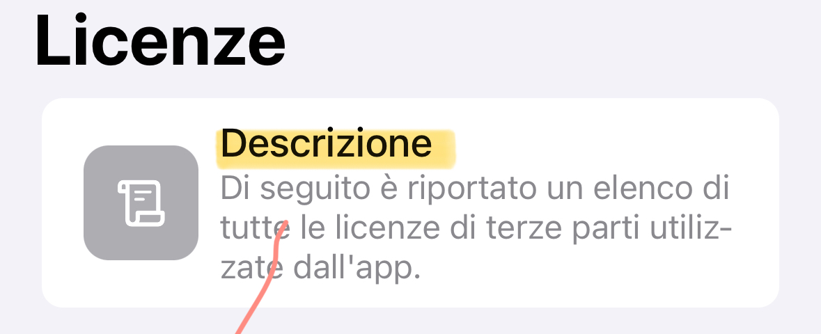
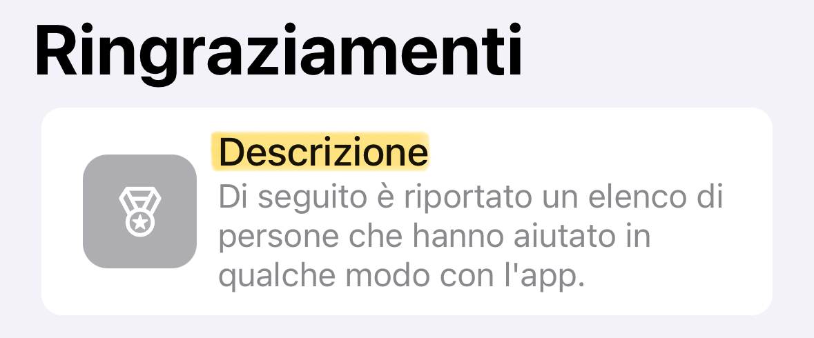
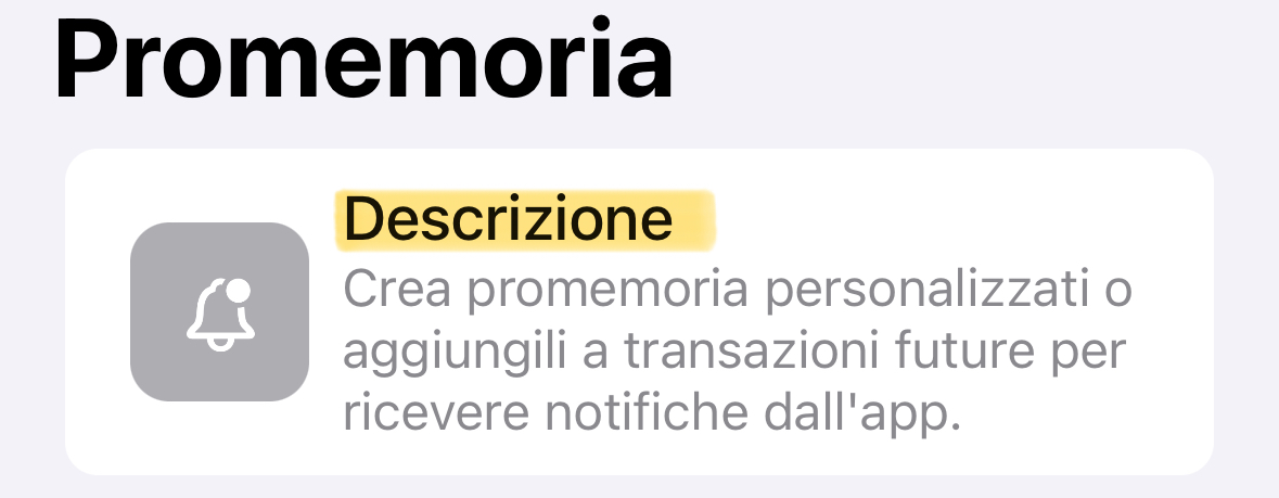
And so on…
Please authenticate to join the conversation.
Upvoters
Status
Rejected
Board

Budget Flow
Tags
✨ Small Improvements
Date
Almost 3 years ago
Author

Fabio
Subscribe to post
Get notified by email when there are changes.
Upvoters
Status
Rejected
Board
Budget Flow
Tags
✨ Small Improvements
Date
Almost 3 years ago
Author
Fabio
Subscribe to post
Get notified by email when there are changes.