Improvement for the monthly Balance graph

Hi! I would like to suggest a little improvement on the Balance graph.
My problem is that in the Balance view you don’t actually have a graphical representation of your monthly balance. By looking at the graph you have to guess if and by how much either of the red/green bars is longer.
My suggestion would be to just mark each months balance and/or connect them with a line (I tried to make two little sketchs)
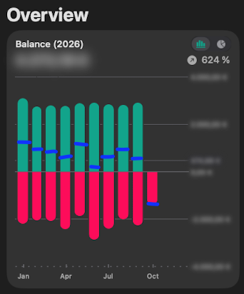
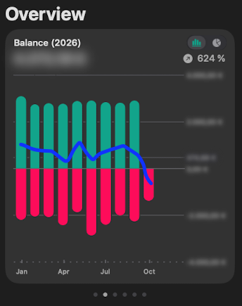
Hope I am not double posting, thanks for considering :)
Log in to comment and vote
No comments yet
Be the first to share your thoughts.