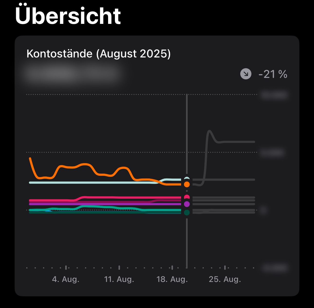
Overview graph whitespace
Currently the overview renders minus values to -5k even though it max went to -200ish.
On the other side I can barely distinguish between the accounts because they all squished up.
On the plus side it’s not so bad.
If you render the overview till the next hundred or even thousand the graphs would be more useful.
Please authenticate to join the conversation.
Upvoters
Status
Inbox
Board

Budget Flow
Tags
📂 Miscellaneous
Date
9 months ago
Author

Danial Ul-Haque
Subscribe to post
Get notified by email when there are changes.
Upvoters
Status
Inbox
Board
Budget Flow
Tags
📂 Miscellaneous
Date
9 months ago
Author
Danial Ul-Haque
Subscribe to post
Get notified by email when there are changes.