Overview tab improvements
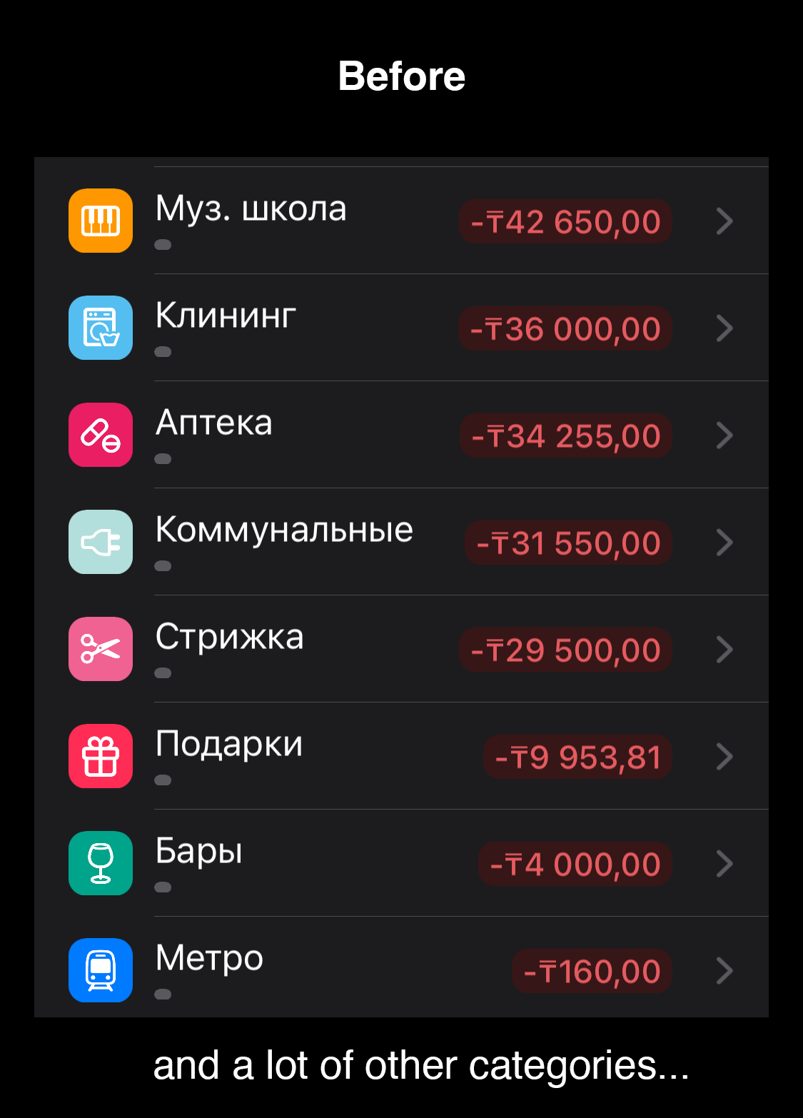
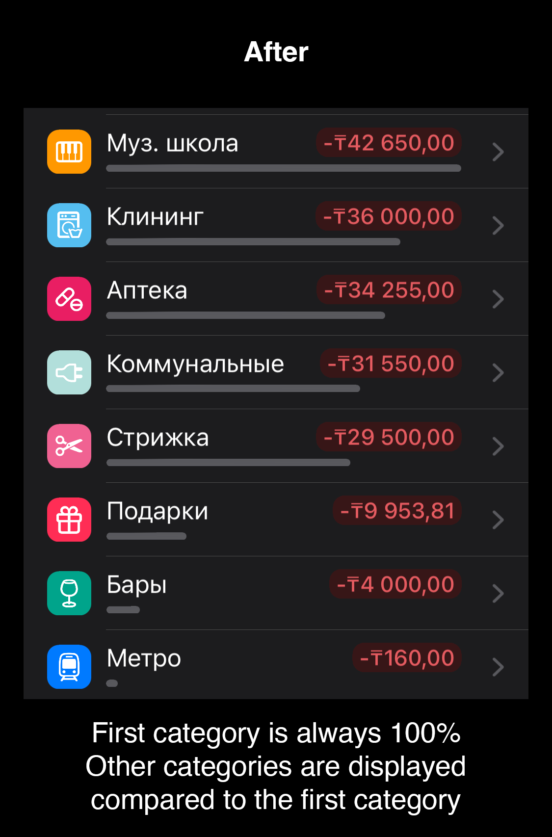
In the Overview tab under some charts we have a table that shows incomes/expenses splitted by categories. We also have some kind of progress bar under each row of that table, to visually compare expenses by different categories.
It seems, these progress bars assume Total Expenses (Total Incomes) as 100%. That's why if user has a lot of categories, that progress bar is usually very narrow and doesn't show any visual difference at all.
I suggest to change that behaviour and use the category with the largest amount as 100% instead of Total Expenses.
I tried to visually demonstrate what I mean. Please see the screenshots
Please authenticate to join the conversation.
Inbox

Budget Flow
✨ Small Improvements
Over 2 years ago

Ilya
Subscribe to post
Get notified by email when there are changes.
Inbox
Budget Flow
✨ Small Improvements
Over 2 years ago
Ilya
Subscribe to post
Get notified by email when there are changes.