Weird button placement

I don’t know if this is intentional but the ‘done’ button placement is kinda weird in terms of visuals and user experience
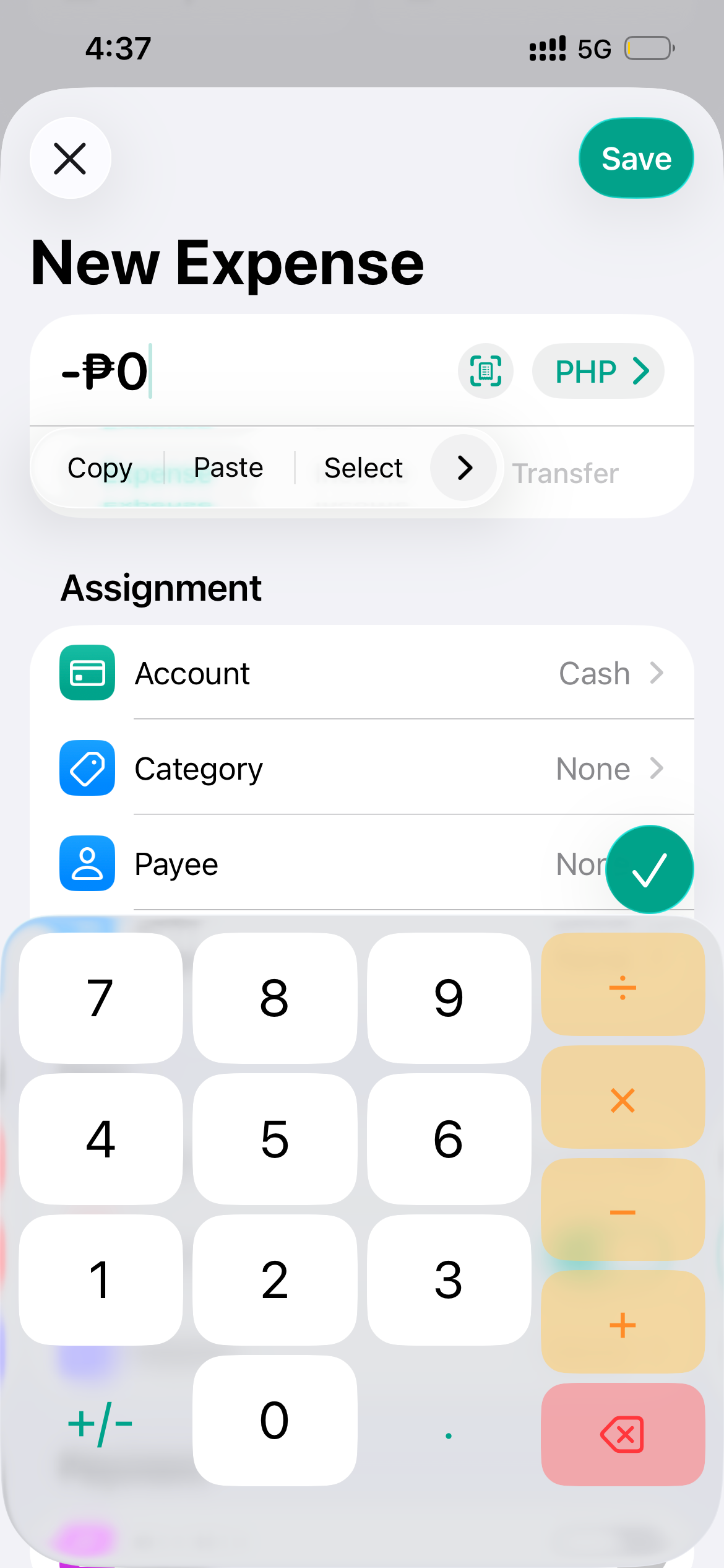
I don’t know if this is intentional but the ‘done’ button placement is kinda weird in terms of visuals and user experience
Log in to comment and vote
Comments1
Fabian
Sep 23, 2025
Hi @Mark Sagang,
thanks for your post. Do you mean the green check mark button? That's the new style for Apple's default “Done” button in iOS 26. If you have any ideas on how I could improve the display, please let me know and I'll see if I can adjust it.
Best regards,
Fabian